The visualization tool interactively displays wind generation over different time intervals in three-dimensional space. The viewer can look across the state to understand generation patterns of regions with concentrations of wind power plants. The tool aids in understanding high and low periods of generation. Operation of the electric grid requires that generation and demand are balanced in each period.
Wind Generation Exploration Tool
The visualization tool can be viewed using current versions of Edge and Firefox web browsers. The tool is not supported for use with Chrome. If you have trouble viewing the map content, a tabular format of the data is available.
HOW TO USE THE TOOL
If you have trouble using the tool with the Chrome browser, switch to using Edge or Firefox instead.
- Select the hyperlink shown on the page.
- Follow the tips listed below.
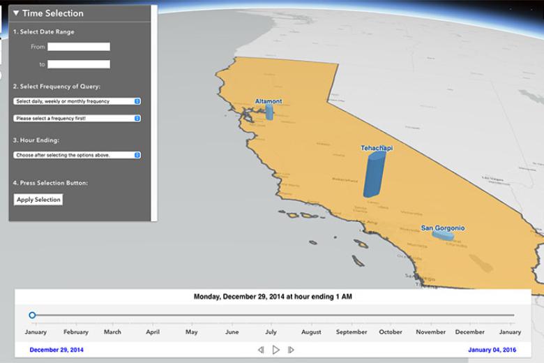
- The visualization loads with navigation and zooming tools on the left-hand side, an interval selection menu in the top left of the page, and a time scale at the bottom.
- The bottom panel contains the time slider, which allows the user to step through and view the CF of the wind generation area in each time interval.
- By selecting Play, the user can also let the data step through the selected time range.
- The interval selection menu may be expanded or contracted to maximize screen space for display of the map.
- By clicking on a column, capacity factor (CF) and other parameters are displayed at the current time step shown in the time slider.
- A link to download the data is provided below.
About the Tool
The height and color of columns at wind generation areas are scaled and shaded to represent capacity factors (CFs) of the areas in a specific time interval. Capacity factor is the ratio of the energy produced to the amount of energy that could ideally have been produced in the same period using the rated nameplate capacity. Due to natural variations in wind speeds, higher factors tend to be seen over short time periods, with lower factors over longer periods. The capacity used is the reported nameplate capacity from the Quarterly Fuel and Energy Report, CEC-1304A. CFs are based on wind plants in service in the wind generation areas.
Renewable energy resources like wind facilities vary in size and geographic distribution within each state. Resource planning, land use constraints, climate zones, and weather patterns limit availability of these resources and where they can be developed. National, state, and local policies also set limits on energy generation and use. An example of resource planning in California is the Desert Renewable Energy Conservation Plan.
By exploring the visualization, a viewer can gain a three-dimensional understanding of temporal variation in generation CFs, along with how the wind generation areas compare to one another. The viewer can observe that areas peak in generation in different periods. The large range in CFs is also visible.
References
The interactive map visualization and data analysis are developed by CEC staff. Values displayed are subject to revision when more accurate data are available. The data used in the tool may be downloaded at this link:
For further information, contact wgrshelp@energy.ca.gov.